Graph can be a very useful tool for conveying information especially numbers, percentages, and other data . A graph gives the reader a picture to interpret. That can be a lot more pages and pages and pages explaining the data .
Graphs can seem frightening, but reading a graph is a lot like reading a story. The graph has a title ,a main idea ,and supporting details .You can use your active reading skills to analyze and understand graphs just like any other text .
Most graphs have a few basic parts: a caption or introduction paragraph, a title , a legend or key, and labeled axes. An active reader looks at each part of the graph before trying to interpret the data. Captions will usually tell you where the data came from (for example, a scientific study of 400 African elephants from 1980 to 2005). Captions usually summarize the author's main point as well. The title is very important. It tells you the main idea of the graph by stating what kind of information is being shown. A legend, also called a key ,is a guide to the symbols and colors used in the graph. Many graphs, including bar graphs and line graphs, have two axes that form a corner, Usually these axes are the left side and the bottom of the graph .Each axis will always have a label. The label tells you what each axis measures.
Bar Graphs

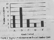
A bar graph has two axes and uses bars to show amounts. In Graph 1 ,we see that the x-axis shows grades that students earned, and the y-axis shows bow many students earned each grade .You can see that 6 students earned an A because the bar for A stretches up to 6 on the vertical measurement. There is a lot of information we can get from a simple graph like this(See Graph 1).
Line Graphs

A line graph looks similar to a bar graph ,but instead of Bars, it plots points and connects them with a line .It has the same parts as a bar graph - two labeled axes -and can be read the same way .To read a line graph, it's important to focus on the points of intersection rather than the line segments between the points, This type of graph is most commonly used to show how something changes over time.
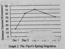
Here is a graph that charts how far a bird flies during the first Five days of its spring migration (See Graph 2).
The unit of measurement for the x-axis is days. The unit of measurement for the y-axis is kilometers. Thus we can see that ,on the first day, the pipit flew 20 kilometers. The line segment goes up between Day 1 and Day 2,which means that the bird flew farther on Day 2.If the line segment angled dawn, as between Day 4 and Day 5,it would mean that the bird flew fewer kilometers than the day before. This line graph is a quick, visual way to tell the reader about the bird's migration.
Pie Graphs

A typical pie graph looks like a circular pie. The circle is divided into sections, and each section represents a fraction of the data. The graph is commonly used to show percentages; the whole pie represents l00 percent, so each piece is a fraction of the whole.
A pie graph might include a legend,or it might use icons or labels within each slice. This pie graph shows on month's expense, (See Graph 3 ).
Food $ 25
Movies $ 12
Clothing $ 36
Savings $ 20
Books $ 7
When used in a graph,a legend is
What is the total number of students who earned a C or better ?
The bird covered the longest distance on
Which of the following cost Amy most ?
 foot and my attacker stopped attacking me.Had I been hurt I wouldn't have found it amusing.And I was laughing.After all, I was being attacked by a butterfly!
 nly admire the love and courage of that butterfly in his concern for his mate.He had taken it up on himself to attack me for his mate's sake (缘故), even though she was clearly dying and I was so large.He did so just to give her those extra few precious moments of life, should I have been careless enough to step on her.His courage in attacking something thousands of times larger and heavier than himself just for his mate's safety seemed admirable.I couldn't do anything other than reward him by walking on the more difficult side of the pool.He had truly earned those moments to be with her, undisturbed.
 ttacks
 clothing or walls by sending out T-rays.
 ose outside his immediate circle of friends.As he begins to have responsibility towards others, he will realize he feels even better about himself.
 d what their future might look like," explains Michelle Maidenberg, a clinical director of Westchester Group Works, a center for group treatment in New York."This is very challenging and just one of the reasons why they are so focused on their own
 world." Once teens participate in community service, however, they begin to look beyond their personal needs.They also learn firsthand about the challenges others face, and they experience a sense of authority as they realize they can make a real difference in others' lives.
 n community service themselves.Teens can learn directly from their parents that personal enjoyment is not ,all that matters.
 community service projects builds confidence."By working with others, teens improve managerial, interpersonal and communication skills.Community service helps to approach maturity when they take a step back to see the needs of other people," she adds.Another reward: service hours look great on a resume!
 say
say ing that I was working hard. His answer to me was, “That’s irrelevant (无关的). Wh
 粤公网安备 44130202000953号